Sunday 30 September 2012

What is the purpose of a magazine film review?

Film reviews can make or break a film. If a respected magazine compliments a film, it is more likely to receive a larger audience, but if a respected magazine rates a film badly, then the opposite effect is likely to happen. The purpose of a magazine film review is to give a professional opinion on an upcoming film for people whom are considering going to watch it. Another purpose of a film review is to potentially 'sell' the film to its audience, similar to the purpose of a film poster, but done in more depth and generally less bias. It is more likely that someone will believe what is written about a film in a review than what a film poster says. This is because film reviews are usually written by well respected magazines/writers, that are impartial and unbiased, therefore making them more reliable than a poster.


Left: Harry Potter 6 Empire Magazine Review
Right: Harry Potter 6 Poster

Both the review and the poster look to be 'selling' the film, but "Empire" is clearly less biased for the film than the poster.


Why do Film Reviews contain an element of risk?:

As said before, film reviews are pivotal to the success of a film. When written by respected magazines, audiences will take in every word they read about the film, and this has the potential to sway their decision from watching it to not watching it and vice-versa. The film 'Catwoman' is a good example of a film that was beaten by reviews, before it even reached cinemas. 'Catwoman' was supposed to be a spin off from the massively successful films 'Batman', and was expected to reach great heights in the film world. However, the film was heavily criticised by film magazines, with Empire rating it 1 out of 5, calling it '"tragic".

Below is 'Catwoman's' Film Review from Empire Magazine:


How do semiotics work as part of film posters in terms of visuals?

Semiotics is the study of signs and symbols on film posters. Film posters are usually full of semiotics, as this attracts audiences to them as they glance at the advertisement.

Visual Imagery in Film Posters:

  1. Colours- help to catch the eye of the intended audience, immediately persuading them to look at the poster in further detail. If all film posters were black and white, people would be less likely to notice them, and they wouldn't perform their jobs as an advertisement technique. 
  2. Images- in all film posters, images are absolutely essential. They help to give the audience a feel for what the film will be about, and act as a replacement for text. 
  3. Layout- the layout for most film posters are generally the same. Often you will see an image in the centre of the poster, followed by the name of the main actors in the film, surrounded by a variety of different colours, and reviews from newspapers and magazines.
  4. Fonts and Titles- usually big and bold, to help catch the eye of the target audience. 


Below are 2 posters I will analyse in terms of Semiotics:


The first thing that strikes you about this poster is the darkness of the colouring. Immediately, the audience assume that the film is very likely to have a dark mood to it, showing us the affects of semiotics on an audience. Also, the main character- Batman- is dressed in an unusual black costume, suggesting to the audience that the film will have something to do with superheroes and villains. Moreover, the fire in the centre of the poster particularly stands out, and changes the mood to an aggressive one, suggesting that the film may contain a lot of violence and 'machoness'. This is backed up by Batman’s pose; showing his authority and strength.


This is an extremely well thought out poster in terms of semiotics. Immediately, the audience can tell that the theme of the film is going to be romance. Bridget Jones' cheeky smile, and lips covered in red lipstick, suggests a sense of 'sexiness' to the film, perhaps mixed in with comedy. The fact that Bridget is surrounded by two men tells the audience that the film is possibly about a love triangle, featuring two men with opposite personalities. The audience can see that the two men’s personalities may differ because one is trying to sneakily look at Bridget’s diary, while the other is posing for the camera. Furthermore, the fact that Bridget is holding a diary suggests that the film may have a secretive edge to it, and that the woman may be playing her two lovers against each other for her enjoyment.

Analysis of a Film Poster- Platoon

Below is a film poster I will analyse:


This film poster is an extremely effective and informative one, for a number of reasons. The first thing that you notice is the word 'Platoon', printed in blood red. The word Platoon is an American word- 'regiment' is the British version- used for sections of the US army. From this we can tell, immediately, that the film will be about the American army, backed up by the use of dog tags (used to identify the bodies of dead soldiers) in place of the O's in the word Platoon. The fact that the word is printed in red points towards gore and violence. The colour red is often linked to blood, and the audience therefore link the two together when looking at this poster. 

Another thing you can notice when looking at this particuar film poster is the character in the centre. He is dressed up in a soldiers uniform- backing up the theory that the film is about the US army. His uniform is dirty, showing us that he has been through a lot of traumatic fighting, and he looks extremely distressed, shown by the way his arms are thrown up in the air, and the fact that we cant see his face. In the background, we can see four guerilla looking soldiers looking at the character- very clearly supposed to be his enemy- holding AK-47s. This suggests that the film is set somewhere in Asia- in around the 1950s-60s- most likely Korea or Vietnam (considering America's history). The palm trees in the background also back up this assumption. 

Finally, the explosion in the background confirms to the audience that the genre of the film will be war/violence. The way the explosion is shown suggests that it was caused by a napalm strike, making Vietnam the most likely setting for the film, over Korea. The explosion also confirms the theory that the film focuses on the efforts of the American army in the Vietnam war (only the Americans used napalm in Vietnam) rather than the Vietcong's viewpoint, or a Vietnamese civilians.  


Wednesday 26 September 2012

Purpose of Film Posters

Film Posters are a form of advertisement for an upcoming movie. They are generally the first form of advertising used for a film, and are put up in places like train networks and on advertising boards on main roads. A film poster doesn't normally contain much information about the film it is advertising- but  usually introduces the star(s) of the films, and usually gives a hint of what the genre will be through the illustration used. It needs to provide a short burst of information about the film quickly and simply, mostly relying on image.


Conventions of Film Posters: 

  • The star(s) of the film is/are usually in the centre of the poster, to highlight their importance and make us notice them 
  • A dark image or background is typical of a crime/thriller genre film
  • The smallest font contains the names of the producer, director etc
  • The largest font is usually the title of the film 
  • "Coming soon", or the release date is also usually on a film poster 

Below is a film poster i will analyse in terms of Technical Codes: 


  • As with most film posters, the stars name is at the top, and in this case, the star is Will Smith
  • Another recurring theme among film posters that appears in this one is a picture of the star, right in the centre of the poster
  • The background images of robots in this picture help the audience to understand that the film probably has a sic-fi element to it 
  • The films title is instantly noticeable, with I,robot being large and right in the centre of the poster
  • Underneath the tile is a tag line. "One man saw it coming" in this case
  • The writing below the tag line is called the 'Billing Block'. The billing block usually lists the name of the producer, director etc. 
This film poster displays all the general themes found in most posters, like an inflated image of the star, the title in big lettering and a billing block. Therefore, it is a good poster for us to examine and learn from when we make a poster for our film. However, to really create a top quality poster, we also have to study other film posters, particularly ones that don't display the normal images/information that people expect to see on a poster. 

Example: 


This film poster, used for the film '28 Days Later' is quite a peculiar one for a couple of reasons. Firstly, none of the films main stars appear on the poster, in any way, and their names don't feature either. As seen on the I,robot poster, an image of the main star of a film is useful to feature, as it is an attraction point for the films potential audience. Therefore, the first thing that catches your eye on the 28 Days Later poster is the absence of a star. Secondly, there is no strap line on the poster. Most posters feature a strap line that relates to the plot of the film, and the title, making it unusual for this poster not to feature one. 

The differences between the posters is mainly due to the audience either of them are targeting. I,robot's target audience is clearly sic-fi lovers between the ages of 15 and 25. We can see this because of the actor used on the poster, Will Smith. Smith wouldn't be used in a film targeted at the adult generations because they would probably not have an idea of who he is, therefore just from the poster we can tell that I,robot is targeted towards male sic-fi lovers in their adolescent. However, '28 Days Later' is clearly targeted towards lovers of horror, denoted from the zombies on the film poster and the font used for the title. 

Development of Film Posters

Movie posters have been used for a long time to promote upcoming movies and attract an audience. They are generally the first form of advertisement used for a film, and usually contain only basic information, displayed through images and strap-lines. As the film industry has evolved, the development of posters has followed, making it an easy task to identify how film posters have become modernised over the past few decades.

Early stages of Film Industry- The 1920's: 

Return to Main Page for The Circus Posters

Film Posters in the 1920's were very simple, and relied on hand-drawn images to identify the film. These types of posters were very expensive to film companies, and could not be widely distributed as a result of this. 

The 1930's: 

In the 1930s, the main characters of the films were starting to be featured on the front of film posters, marking the rise of celebrity fame through film. Bolder text was also used, compared to the small comedic type text used in the 20's. 


The Mid-War era- 1940's: 


Characters become a prominent figure on posters, and the name of production companies start to become more visible, as they grow in reputation. 

Post-War era- 1950's: 


More 'mysterious' forms of posters is identifiable. Production companies slowly start to produce posters that do not feature characters or images, to create a mysterious atmosphere and tempt people to view the film.

1970's: 


Photography becomes a regular feature on film posters. 

1990's:


We start to see posters shift towards the more modern poster type, with a central main image, a strap line, and the names of the main characters featured. 

Modern Posters: 


Posters become essential to the promotion of films, and we see an improvement to the basic posters of the 90's. 


The development of Film Posters

Since the growth of cinema, movie posters have been used to promote films and create buzz. Just as the style of cinema has evolved, the design style of these promotional posters has changed. Poster printing was also a hard thing to get over in the early 1900s, the prices for the promotion images were high and not always easily printed. However things have changed in today's modern due to the power of modern day technology.

The 1920s:
The 1920s was known for movie posters that employed fairly traditional type for the time and hand-drawn illustrations over stills that depicted scenes from the movie.

1930s

In the 1930s, we see a shift towards bolder typographic designs with a growing tendency towards illustrations focusing on main characters of the film, particularly faces, over depictions of scenes.


1940s

By the 1940s, we rarely see scene depictions anymore. Character illustrations are most prominent, and typographic treatments are a little more subdued after the experimentation of the 40s.

1950s

In the 1950s we start to see poster designers trying conceptual approaches, such as the Love in the Afternoon poster which is free of characters, emphasizing typography and subtle clues as to the movie content forming the type’s background.

1960s

60s posters don’t go as far as getting rid of illustrations altogether, but typography plays a more important role in the layouts. The illustrations move to a more peripheral role, adorning the type.

1970s

An example of the fast movement of trends in the design industry, the 70s sees photographs play a big role in posters for the first time, often taking up the bulk of the poster.

1980s

The 80s is where we start to see the movie poster in a form similar to what we’re used to seeing today. Large photographic backgrounds are more common than ever, but type and imagery are more balanced than we’ve seen in previous decades which favored one over the other.

1990s

Posters of the 90s are reasonably formulaic: we’ve got the photographic backgrounds, slogans, and billing blocks sitting quietly above or below the film title, usually near the bottom of the poster.

2000s

Through the 80s and 90s we see the evolution of movie posters slow down as designers hit on a series of winning layouts. In the 2000s we see  improvements to keep up with trends in typography and photography, but the layout often remains the same..

Despite the changes of film poster throughout the decades in terms of content layout and purpose, it is clear to see a strong link between the imagery, evidently the images have always played a huge role in terms of depicting the style/genre of a film, furthermore another important aspect of film posters throughout the numerous decades are the typography the varying types of fonts, sizes as well as colours of the poster typography can suggest a lot about a film.

How do semiotics work as part of film posters in terms of visuals?


Semiotics is the study of signs and symbols and the message we read in them.
Film posters are full of semiotics, this ensures that the audiences quickly process the just from necessary information just from the visual imagery contained in them
It is important to consider all the visual imagery in film posters, they consist of:
>Imagery
>Colours
>Titles and Fonts
>Layout

Semiotics are extremely important therefore many film posters rely on them heavily, as it gives the audience and understanding of what genre or theme the up and coming film take on, through the clever use of signs and symbols.

Analysing film posters in terms of semiotics:


By just looking at the Bridget Jones's Diary the audience gets the impression that the film may be a Romantic Comedy simply by recognising the semiotic aspects. Just like many british Rom-Coms, the background is traditionally white, emphasising on the fact that it is a Rom-Com, furthermore the characters expressions in inparticularly Bridget Jones having a smirk on her face, seem to imply that there will be perhaps an element of mischief surrounding the relationship, especially due to the fact that there are three people involved in the relationship, this links in well with the genre of the film. The use of the diary is also important as it symbolises, secrets which once again links in well with the genre of Romantic Comedies.


The film poster for Platoon uses semiotics very well. The background image first of all denotes war, with the various explosions as well as soldiers battling with guns, the use of palm trees in terms of symbolism is used very cleverly, palm trees usually represent peace and paradise, however in this case the palm trees are used to represent the pain and grief from the war in Vietnam. Placed right in the centre of the image is the main character, who is a soldier denoted by his uniform, the character comes across as if he has been shot due to his position and his face is not on show, implying that the victims of war can be anybody. The font for the title is a very solid and masculine one, suggesting strength, linking to the theme of war, dog tags are also evident in the title, replacing to O's, just like they replace soldiers lives and following on from the death of soldiers the tagline 'The first casualty of war is innocence' reflects the theme of death and war within the film.

What are the main conventions and elements of Film Posters?

CONVENTIONS:

As regards to film posters there are three main types of conventions which help construct a film poster; the technical codes, written codes and the symbolic codes.

>Technical Codes:
Techniques used in the construction of a text for example the film titles, tagline, billing block etc.

>Written Codes:
The range of context in which words are used in the text, for example titles, taglines etc.
The taglines, are often catchy  enticing short phrases used to advertise and sell a movie and to sum up the plot, tone or theme of a film. They reinforce the genre, audience and in particualar, the narrative of the film with is extremely vital as theses aspects can determine the target audience.

>Symbolic Codes:
The system of signs embedded within the text itself, such as connotations of images, colours, font styles. Including Semiotics, which is the study of signs and symbols and the messages we read in them.

ELEMENTS:

Many successful film posters contain certain elements in order to appeal to audiences, provide information, and display the genre’s and themes of the film, etc. 
The elements consist of:>Main actor(s) name
>Background images
>Image of star or an iconic image from the film (point of focus)
>Title of film
>Tag line
>BBFC certificate
>Billing block

All these elements merge together to create an almost perfect film poster in order to attract the audience, each element has a specific intention in terms of appealing to the public and attracting the right audiences. Evidently the inclusion of characters names and or a main image of the main character, works to a great effect, most of the time mainstream films, would introduce images of famous or popular actors who may have had success within previous films, this would attract a wide range of audiences who are very familiar or have heard positive things about the characters to possibly watch the film. The tagline as well as title is also a very important aspect regarding film posters as it gives a sort of summery of the film in the space of a couple of words, once again this could be a great tool in terms if attracting the audiences, also the title can be very symbolic the type of font which is used can suggest what sort of theme or genre the film may take on, judging by the Gladiators title, the film is portrayed as a film possibly set in the past/Roman era etc and the fact that the character is holding a sword and the background image illustrates a Colosseum we get the impression that the film is in fact about gladiators. This film would therefore appeal to audiences who are interested in history and also enjoy action films.


What is the purpose of a film poster?


What is the PURPOSE of a film poster?

Film posters have various purposes which make them a vital tool for the success of any film. The main purpose of a film poster is to advertise and inform the audience of an upcoming film, by illustrating important information such as the release date, the actors and suitability with reference to age. Film posters merge illustrations, lettering, colouring and a clever layout to create a 'movie-at-a-glance' image to entice an audience into seeing the film. They focus on visual elements such as, powerful photographs and graphics to make posters attention grabbing and something the audience would want to see. These visual elements can also give the audience an insight into the themes and genre that will be portrayed throughout the film. 


Film posters can appear in a range of places ranging from billboards, train stations, bus stops, on the sides of buses, inside and outside cinemas, in magazines and on the internet. These places are all very convenient as regards to the public, as they are all very easily accessible and they all play a huge role in the everyday lives of the public, for example a member of the public could be commuting too and from work and the cleverly situated film posters will attract there attention. The main reason for this is to advertise films to the general public or to their specific target audiences. Film posters are also very useful in terms of promoting films to the wider public, making them aware of the film before its actual release.


Film Posters are created by film marketing companies, as means of advertising in order to promote up and coming films to the intended target audiences. Due to the fact that film posters are institutional and created by the film marketing companies, they will indeed be biased in order to make the film seem as good as possible as the main aim is to promote the film in order to attract the right audiences to gain income.


Film poster appeal to a specific target audience through the clever use of photography, typography and symbolism displayed on the page.


This Batman film poster is clearly intending to target male audiences, from possibly mid teens and above. The symbolism of the poster is very clear, with its dark and gritty exterior, this poster gives of the impression that the film will be action packed etc. this really appeals to the male audiences. 


Contrasting the Batman poster, this mean girl poster has a very pink and glossy nature to it, the intended audience for this poster are young girls, all the characters are female and the bright pink colours as well as the glamorous look to the poster will truly appeal to the intended target 


Certain film posters have even one to the extent of releasing different types of film posters in order to appeal to different target audiences.


Firstly the US version of the film Elizabeth, portrays the main character Elizabeth as a very powerful character , this could possibly appeal to more female audiences as appose to male audiences. 


The UK version of the film poster on the other hand, is mainly dominated by men, Elizabeth does not take center stage within this poster, all the characters are portrayed as equal and the fact that the males seem to dominate, this poster therefore could possibly appeal to the male audiences.

How does semiotics work as part of film posters in terms of visual codes


The start trek poster caught my eye, like other film posters is the main image, within this image is three of the main actors of the film. The actors faces look serious showing the audience that film will be very gripping and serious. Hard low key blue lighting is used to create an atmosphere within the poster and it is also quite different compared to other posters an unsual choice yet very effective as it catched the eye.


This is done to show awarness of the actors but it also add more emphasis to the title as it is smaller. The title of the film stands out at the bottom aswell as the tagline directly underneath which is placed there for the audience to memorise in their heads. The billing at the bottom shows the release date of the film.

#
 
This film poster is essentially the same and follows the conventions of a film poster, however, in this poster the tagline is at the top possibly indicating an important line from the film itself therefore putting at the top signifies its imprtance. The title of the film is in bold to catch the audience eyes the billing is directly underneath that again to show awareness to the audience on the release of the film. whilst the actors are printed in small at the bottom.

What are the main conventions of a film poster?


There are many conventions of film posters in terms of technical codes. film posters have a title,to attract the audience and make it stick in their heads also could relate to the genre to make them aware of them theme; additionally the can utilize full awareness from the title by making it bold and colourful hence it stands out from the background to stand out from other competing film posters.
 
Furthermore the titles font can reflect the time era of the film or add effect to move the narrative forward.Secondly persuasive language is used in the tag lines to attract the reader to the film and help them memorise it which is the main purpose of a film poster one in which the audience and looks at once briefly and for them to look back again in much greater detail.

What are the Classic examples of film posters?

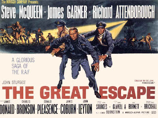
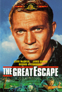
This film poster is from the movie The Great Escape which was made in 1963. The bold titles and distinguished image attracts the audience starighaway, also which is unsual is that it is landscape today film posters often are portrait.
It has since been adapted for DvD purposes and now includes an image of the main character in full and not something which was drawn out which you can see on the previous poster.


Purpose of film posters

Film posters are viewed by audiences in all locations. From a very early date, they have been usually found in all underground stations as it can then gain access to mass audiences. The number of people that travel to and from work and school on a daily bases mean that film posters of all genres are bound to be located to access all audiences of all ages. Moreover, these poster can also be found in newsaper, magazines, billboards and wherever it can gain viewers eyes. Therefore it is vital that the poster meets the purpose in order to attract the traget specific audience into wacthing the film.
Other than the need to meet the target specif audiences, the second main purpose in producing a fillm poster is to promote, as a form of advertising. This too is linked with the the main reason, to reach target specific audience. Using the correct positive information will indicate to the wide audience exactly what the film genre is and give an insight into the narrative of the film. This is essential, as wrong or misleading infomation may put foward the wrong message and gather the incorrect audience.


What film posters provide

From the film poster, audience should be informed about the genre of the film. The genre is evidentally important to portray as this will be a reason for why audiences would see a film. Therefore by indicating this in the poster would help bring this across. They should also be able to recieve infomation on the actors and directors involved in the film, the release date and the suitability of the film. These are all import to include in a film poster. For instance classification would identify to parents whether the film is suitable for their children to watch, whether it is too graphic or advanced. However this should also be evident by the visual elements that the poster emits. Including actors names may also intregue audience into watching their film. If the film inlcudes a well known actor then it is more likely to attract audiences.

Themes of British identity


Short films allow both small and big time directors to produce more unconventional films, with diverse themes and unpopular genre's. Considering that our short film should be identifiably 'British' there are many themes that are possible to be considered : class and status is an issue in British society this could have an impact on a large scale audience thar suffer day in and out because of what they are titles under.
Example 1: Robin Hood
According to the Independent online:


There were 2.9 million children who lived in families where the household income was just £236 a week – or £12,300 a year – considered as the poverty line in Britain.

The annual study into poverty laid bare how thousands of children cannot afford basic treats, with 31 per cent of all children – the equivalent 3.97 million – unable to take a week's holiday with their family.

In many parts of Britains there are poverty strickened areas. Our project could be the poor staling from rich like in Robin Hood, stealing for better not the worse, so what better topic to base our short film round than this.
As a nation Britain is obsessed with fame and reality. Possibly could show how obsessed we as 'Britons' have become with such shows like X Factor and Britains Got Talent. In the 2011 X Factor final 13 million viewers tuned in to watch. although this figure was down on last year it shows how engrossed the general public is in fame and reality, surely this would be a great genre to base our short film round.


What are the potential audiences for short films?

Short film has very limited genres in the film industry. They do not are have mass advertisement compared to feature films and not many well knows directors produce them. Short film caters for a very small niche in the market.

 Short films deal with controversial topics that feature films would not go near, themes that maybe audience can realte to, but also brings them awarness of topics which are not globally advertised However,a fewof the short films are not made to tackle such issues, but to entertain such as‘sign language’. Films that try out new ideas like documentaries tend to make the film industry are normally shown on channels such as BBC3 and Channel 4.


The types of people that tend to go see short films vary. this can range from any old movie goer, to that that appreciate the art and purpose of the short film; those that like to think about public issues and are thinkers. But to find the potential audiences for short films we should look at who makes them first.


Typically short films are made by media students normally for there coursework in college or university. New directors tend to make short films  o show off their directing and promote themselves in the film industry. so poententially established directors in the film indutsry can be considered as potential audience. Directors of short films are familiar with the certain audience they aim to please therefore the conventions they portray intend to meet the likes of these niche audiences.


The British Board of Film Classification (BBFC) limits the audience depending on what age is on the BBFC certificate. If for example the BBFC was 18 then the new generation of young people using the internet will not be able to watch it, which will cut viewing a lot. This means our short film will have to stick to content allowed below the 18 certificate. I think the most appropriate age is a 12a, this is because we will still be able to touch on a deeper topic which is one of the purposes of a short film and they are old enough to give the important message to without cutting views a great